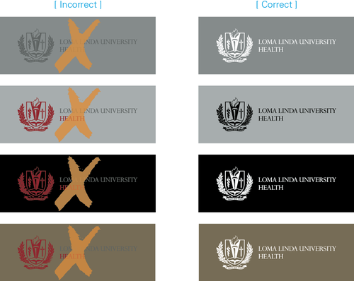
Displaying the logo over a colored background, image or pattern can compromise impact and readability.
Refer to the examples on this page to ensure sufficient contrast between the logo and the background.
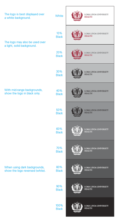
Preferred Background
The best way to display the logo — whether in Regent Red and Platinum Gray, Regent Red only, Platinum Gray only, black only or full color (for Children’s Hospital) — is over a white background.
Light Background
If the background is light (0-20%), the logo may be used in Regent Red and Platinum Gray, in Regent Red only, in black only or in full color (for Children’s Hospital).
Medium Background
If the background is mid-range in terms of darkness (30-50%), the logo is to be shown only in black for maximum readability.
Dark Background
When using a dark background (60-100%), show the logo reversed (white).
Background Image or Pattern
If the logo must be displayed over an image or pattern, take care to maximize readability by using whichever version of the logo (Regent Red and Platinum Gray, Regent Red only, Platinum Gray only, black only, reversed or, for Children’s Hospital, full color) provides the most contrast.

Sufficient contrast is achieved by placing the logo over a less busy portion of the image.

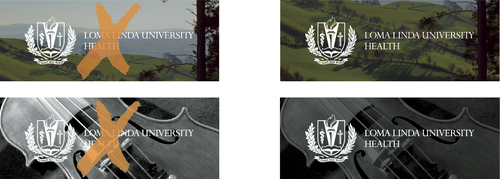
Sufficient contrast is achieved by darkening a busy background.