Components
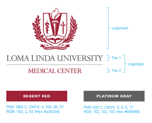
The preferred format consists of two components: the logomark and the logotype. These two components are always placed in a fixed relationship and should never be redrawn or modified in any way.
Preferred Configuration
In the preferred configuration, the logomark and logotype are centered vertically. This is the arrangement of choice for most applications. For other options, see configurations below.
Logo Colors
The logo colors are Regent Red and Platinum Gray. Regent Red was selected as the logo’s lead color because it delivers a message of strength, innovation and leadership. It has a commanding presence and is a classic, timeless color. Logo colors are set with fixed color applications, the logomark and each line of the logotype should not be edited or altered.

Children’s Hospital
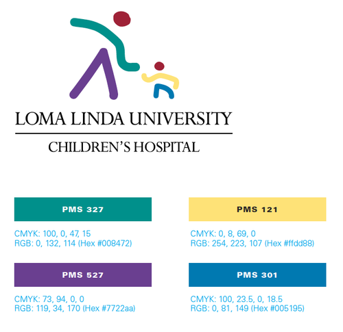
When the logo is used to represent only Loma Linda University Children’s Hospital, the Children’s logomark is incorporated as shown. The preferred format for this logo application uses four colors from the palette (PMS 301, 327, 527 and 121), in addition to Regent Red.

Configurations
Preferred Configuration
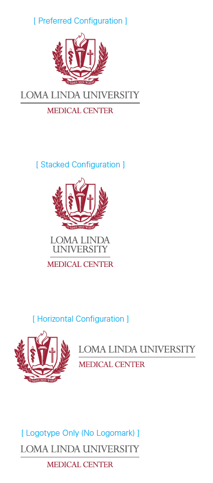
The preferred logo configuration features a vertically centered single line for Loma Linda University. This is the format of choice for most applications.
Alternate Configurations
When space limitations preclude the use of the preferred configuration, use the stacked or horizontal configuration.
No other configuration of the logo should ever be used.

