The logo was revitalized in several ways:
- Updated typography
- Removed box, allowing details to be enlarged without increasing overall “footprint”
- Simplified color scheme
- Redrew oak branch for clarity
- Simplified staff of Aesculapius for better rendering at small sizes
- Filled in cone shape in shield for higher contrast
- Redrew flame for more dynamic effect
- Refined torch for clarity and better rendering at small sizes
- Redrew Bible for more contrast and weight
- Replaced broken sword with Christian cross — a more widely recognized symbol of mercy and compassion
- Removed date in order to simplify logo, making it more readable in small sizes
- Introduced visual “breathing room,” opening up spaces between elements (especially branches and shield)
- Redrew scroll, giving it more fluid lines and filling it in for added weight and contrast
- Enlarged motto and set it in stylized typeface to better blend with other elements
- Established Loma Linda University Health as master brand
![]()
1990 Logo — Style B
![]()
2008 Logo
The First 100 Years
Changing With the Times
As the organization has changed throughout its first century, so have the names and symbols that represent it.
1906 | Loma Linda Sanitarium
First graphic identity symbol revealed at dedicatory exercises
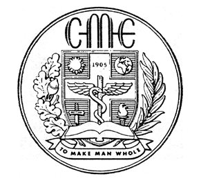
1920s | College of Medical Evangelists
New name and new seal introduced; seal subsequently revised by replacing caduceus with staff of Aesculapius and adding globe
1930s | College of Medical Evangelists
Further refinements made
1959 | College of Medical Evangelists
Symbols currently used in institution’s logo and in seal first appear
1961 | Loma Linda University
Another name change necessitates new symbol
1990 | Loma Linda University
Updated logo and new, institution-wide graphic standards introduced
2008 | Loma Linda University Adventist Health Sciences Center
Updated logo, seal and Graphic Identity Guide introduced
2012 | Loma Linda University Health
Loma Linda University Adventist Health Sciences Center name changed to Loma Linda University Health